Annual reports Museum Boijmans Van Beuningen
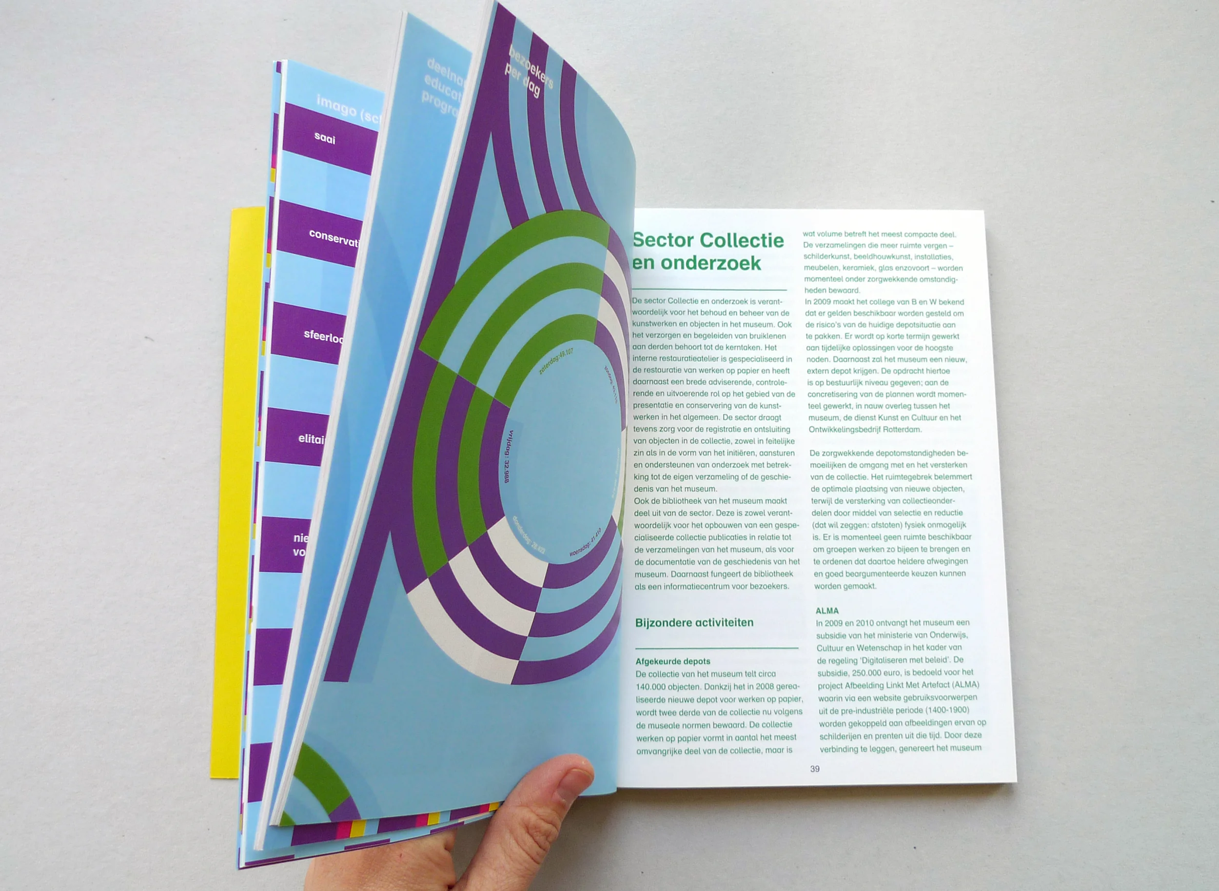
Since a decade the annual reports of Boijmans follow some clear guidelines: A5, full colour, about ten chapters on white paper, about six attachments on brown kraft paper, two column lay-out, logo in the bottom of the cover on the left.
Next to images of the exhibitions and pieces from the collection, it is all about the three-lined graphics on the cover and on the title pages. It can come in the shape of an alphabet, as digits, a flipbook, colourful patterns or as infographics. More about the identity of the museum here.
Made in a design team at Thonik.


