VPRO
An organisation of makers
The VPRO was established in the Netherlands in 1926 as a religious broadcasting organisation but became more (social) liberal in the 50s. It was the first to show a nude woman on Dutch television, Phil Bloom in 1967, in the Wim T. Schippers show Hoepla. The VPRO is known for producing quality and avant-garde programmes. Many dutch people grew up with VPRO and feel strongly attached to its independent attitude.
With respect to its heritage, the identity needed an update to attract new audiences and to remain visible on the tumultuous dutch television landscape.
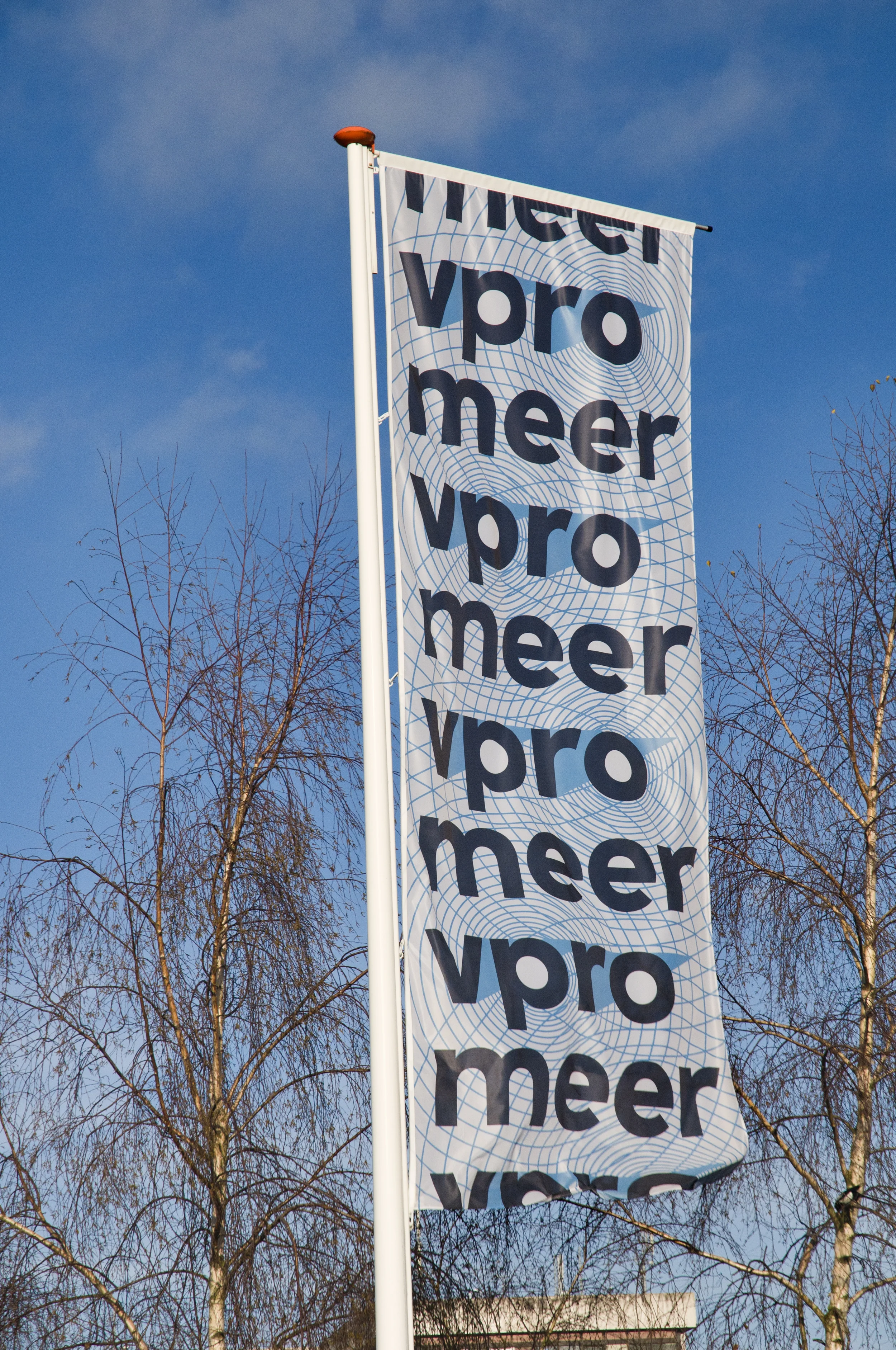
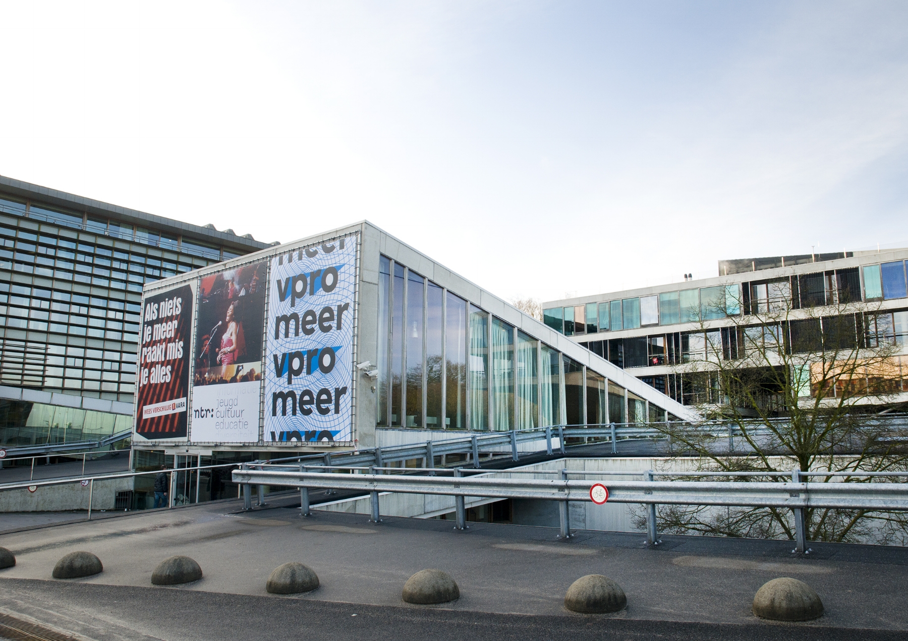
With a new font and two inner shaped circles exactly positioned on two triangles, Thonik created a visual motif for infinite variations, suitable for any conceivable context. The triangle shape refers to the old logo, but everything else is new and responsive.
Made in a design team at Thonik. Font in collaboration with Bold Monday.
Cover illustrations from left to right by Tim Enthoven, Krista van der Niet, Paul Faasen, Olivier Heiligers, Leonie Bos, Matrijs van Merg.
The title of the magazine can react to any type of image. In collaboration with Piet Schreuders.
3voor12 is VPRO's multimedia platform for quality pop music. It has grown from an underdog position, to the Netherlands most important alternative pop platform. Websites in collaboration with VPRO Digitaal.
"An anarchistic type of Sesamestreet, that's gotten out of hand"
– Henk van Gelder, NRC Handelsblad
